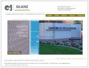
“Rebranding has kept us one of the top architectural sign manufacturers in San Diego County,” says Don Glanz, owner of Glanz Signing + Graphics.
We’re happy when clients decide to invest in their brand, but it’s imperative for us to know how our efforts have helped their company grow, especially in today’s competitive market. Glanz Signing has provided great service for the Studio over the years, with Don’s company fabricating all of our client environmental signage, including that for Taylor Made-addidas and Invitrogen (now known as Life Technologies).
 In 2010, Glanz Signing’s rebranding was accomplished as a result of the collaboration and articulated ideas from Don and the Studio. A modern, stylized logo using negative space was designed to honor and signify the “G” in the Glanz family name. The website was redesigned with emphasis on simplified access and ease of navigation. New content promoted the company’s longevity and their impact on the community. The company’s most recent installation projects featured their wide-ranging presence across dozens of commercial applications, from The Scripps Research Institute to the USA Olympic Training Center. The company’s work can be viewed throughout San Diego County.
Glanz has been in business for over 40 years, designing, building and installing custom signage. While working with a lot of architects and graphic designers, the company knows and appreciates great design. Glanz is aware of what it means to project an image to their prospective clients – an image that must command attention in a crowded field.
Now that it’s been almost two years, we spoke with Don about the effects his new logo and website have had on his clients and the company. “We’ve received positive feedback on the website and an increased recognition for our work. The rebranding has allowed us to direct clients to the site to see some of our latest projects, and to educate them on the differences in materials and what may work best for their projects,” Don shared.
Regarding the logo, “We have always had a good image in our industry. We have been known for our quality, honesty and dependability,” said Don. “The redesign of our “G” logo really brought our image up to date. We have been in San Diego since the ’70s, so the “G” logo and the family name associated with it have been a staple in our industry for 40+ years. The rebranding has shown that we are staying current and giving our clients the latest technology and knowledge regarding trends in signage.”

