We asked our Studio 2055 designers and programmers a big question, “What are the new trends for website design and UX?”
“The biggest web and app design change right now is flat design,” declares Annie Sexton, our web programmer. “It’s where buttons, navigation items and colors are generally solid and opaque, almost cutout-looking at times. The explosion of mobile devices has forced designers to find new ways to show their information. With five billion mobile users, I really don’t see it as a trend, but more of a necessity. Gmail, Windows Mobile, and the new iOS 7 all employ this style. Also, new website design is using vertical scrolling. Mobile has also encouraged this evolving style. Where scrolling used to be annoying for users a few years ago, it’s now being used as an effective way to give content space, gliding visitors easily through the page. It’s a style the Studio employs to lead users to a particular call-to-action such as signing up for a newsletter.”

For years, we’ve been accustomed to buttons and graphics that appear three-dimensional, or employ skeumorphism, both on websites and our cell phones. With the release of Apple’s iOS7, we’re experiencing flat design. “Flat designs take a distinctively more minimalist to how content and functionality are presented. Rather than using visual metaphors and embellishment, flat design relies on foundational elements like shape, color and typography to convey meaning,” explains Steve Johnson in E-Commerce Link: The Rise of Flat Design.
Flat Means Simpler
Flat design is simpler with less clutter on web pages. Design concentrates on functionality and the user experience. With less fussy elements, shape, color and typography take center stage. Colors are brighter and bolder and contrast is used to show the relationship between form and function. Aside from look and functionality, websites that use flat design tend to have less data to load within a browser, thus decreasing load times. Our new website utilizes these concepts and elevates the user to experience our story and brand style.
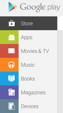
Websites using flat design: UT San Diego, Google Play, Apple’s iOS 7 display

Vertical Scrolling
A few examples of vertical scrolling are sites we created for GBG & Associates and Hope-Amundson. Jez Callejas, lead graphic designer at Studio 2055, notes “This trend is a result of the proliferation of smartphones, which has limited screen real estate and takes advantage of gesture-based navigation. The whole idea of ‘above the fold’ for important content becomes less important because of the screen size. Big and spaced-out graphics are important so it’s easy for your eyes and thumbs to navigate.”
“As a web designer, it is important to give the fold the respect it deserves while also acknowledging its diminishing importance,” states Alex Caldwell in Above the Fold vs. Below the Fold: Everyone Scrolls.
Drop-down Header vs Fixed Header
“For mobile viewers, the drop-down header bar, shown on the GBG site, ensures the user can navigate anywhere within the site at any point. Fixed headers can be a nuisance when screen sizes were smaller and screen real estate was so valuable. Now with larger screens, space isn’t as much of an issue. To have a header that’s always available allows for a more fluid UX and ensures the header (and logo) can be seen at all times,” adds Taylor Schultz, graphic designer at Studio 2055.
To consider if your website needs updating, review the “8 Reasons to Refresh Your Website” and contact Nanette Newbry at 760-729-8205 for a website evaluation and project scope estimate.


