 The fun part about designing a new logo is the process. To come up with something unique, creativity has to flow. Funny, crazy, ugly, funky all get thrown into the mix; there is no wrong. Eventually, the process can create art that informs and impresses the viewer.
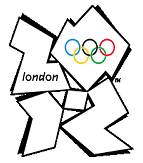
Take the 2012 Olympics. Designer Wolff Olins created the logo, unveiled June 4, 2007, aimed at reaching and engaging young people. Originally, the public reaction to the logo was negative; more than 80% of votes gave the logo the lowest possible rating. Over time, the logo has stuck and has been licensed to print by official sponsors such as Coca Cola, DOW, BMW, VISA and Adidas. According to Marketing Week, “The Olympic Delivery Authority is employing almost 300 hundred people to crack down on guerrilla marketing stunts by monitoring vendors operating within 500m of Olympic sites in London.”
Olins’ logo is representative of the number 2012 and embeds the Olympic rings in the zero. He chose four colors, green, magenta, orange and blue, and created an edgy, urban look that appeals to the young audience that the Olympics has traditionally had a difficult time connecting with.
“The Paralympics logo (far left) and the different official colour combinations for the Wolff Olins main logo design” Source: http://en.wikipedia.org/wiki/File:All_London_2012_logos.svg


